 ← All work
Full-stack rebrand · Brand systems · Campaigns
Getting the brand ready for Series C.
Komodo Health had built the largest linkable map of human health in the U.S. Its next stage required a brand story and visual system that could express the scale of that ambition with more clarity, humanity, and confidence.
The problem
Komodo was moving from challenger to category leader, but its story remained focused on software features. The brand needed a more distinctive point of view for investors and customers—and a system that could scale across product marketing, campaigns, and internal communications.
The solution
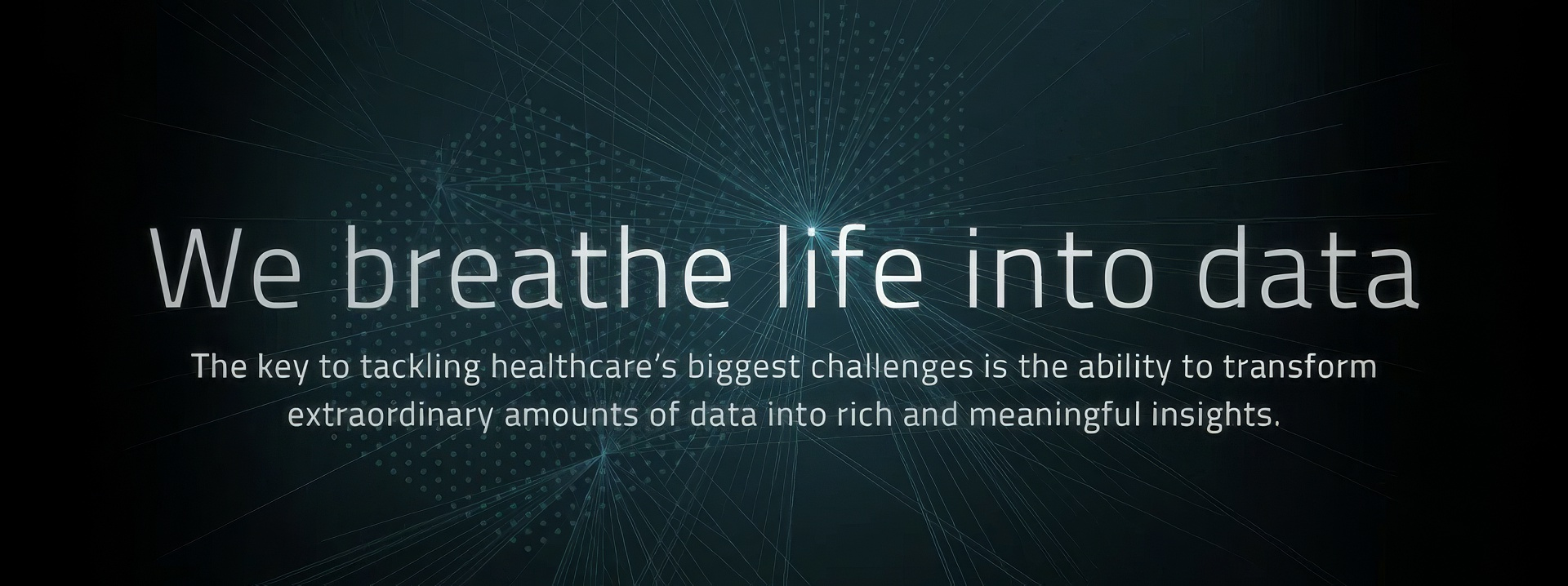
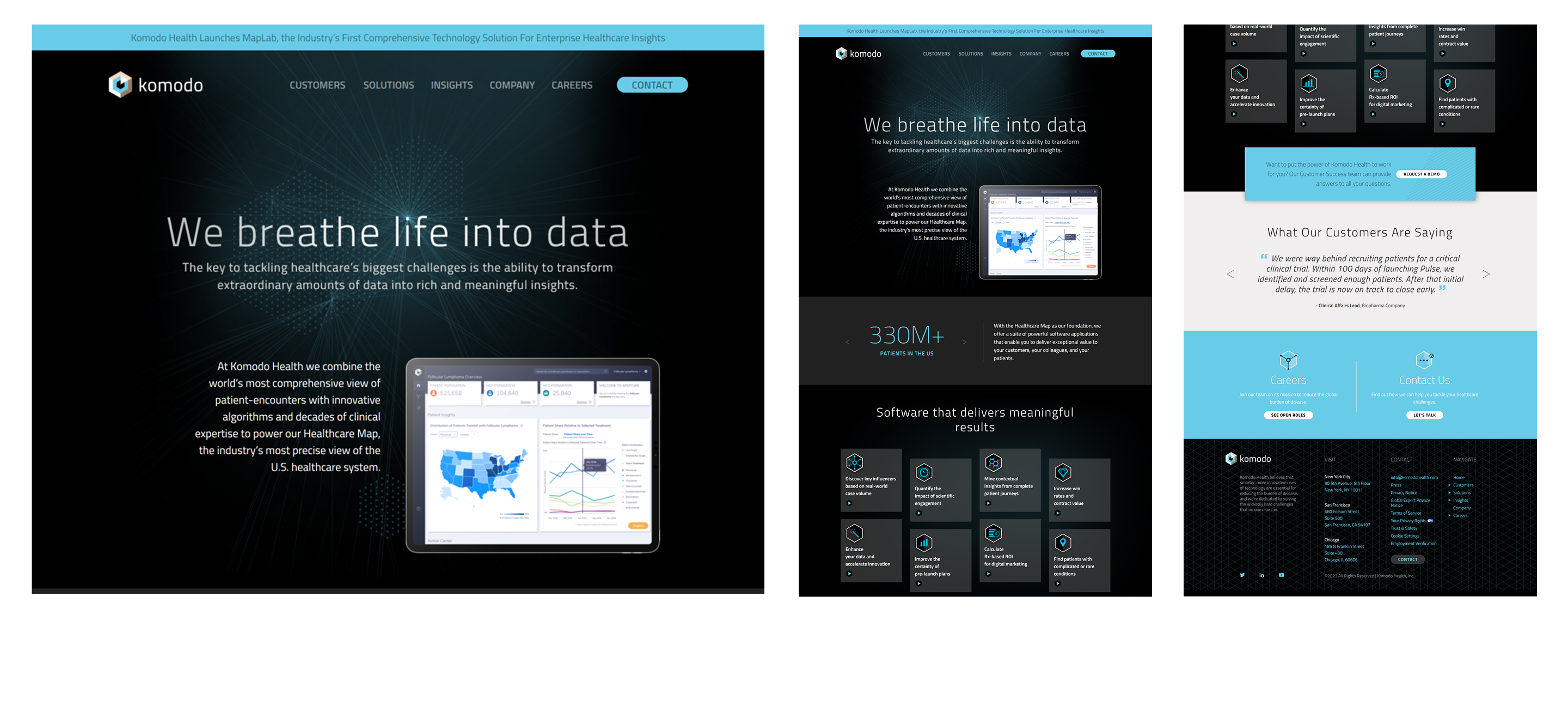
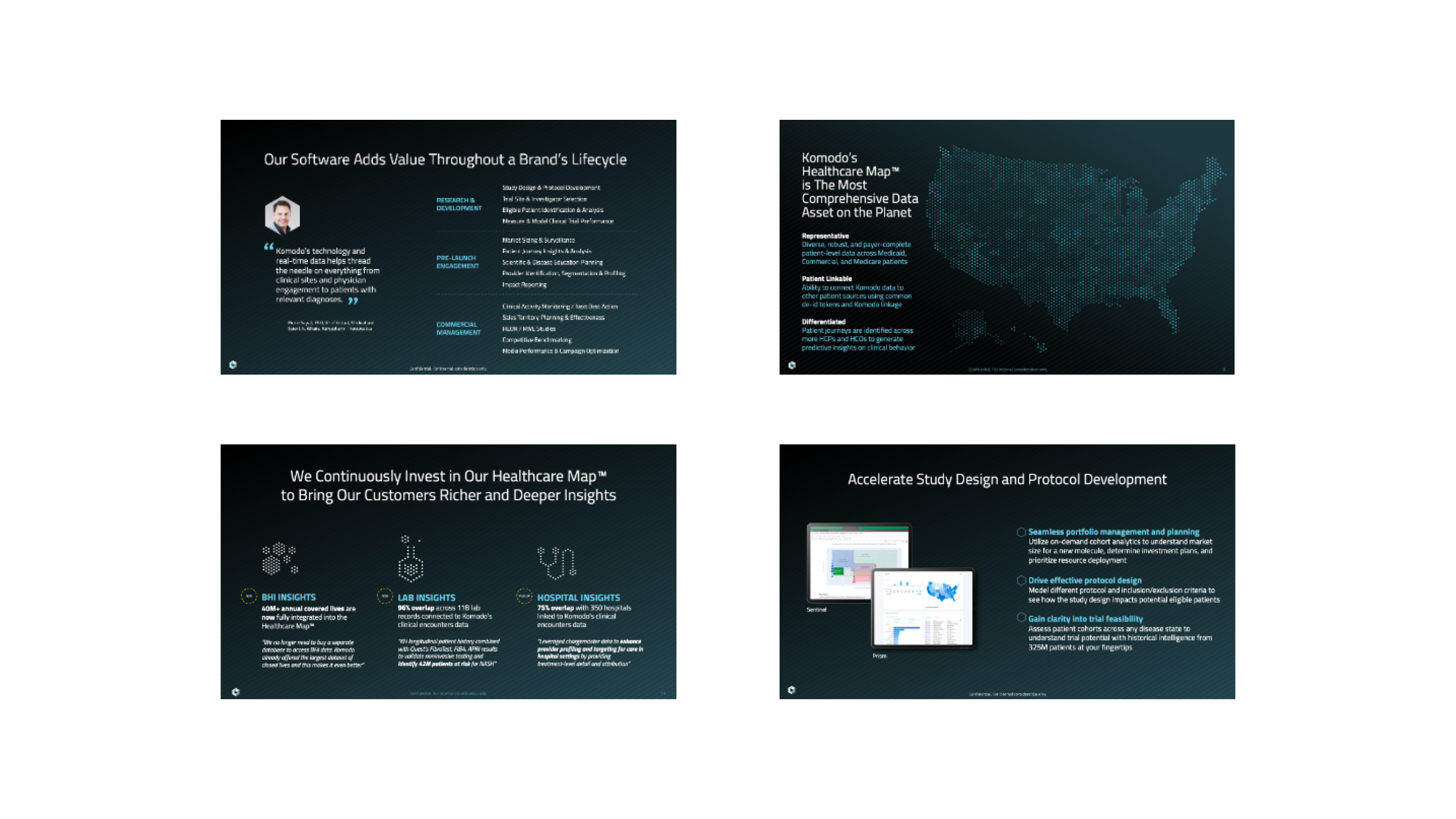
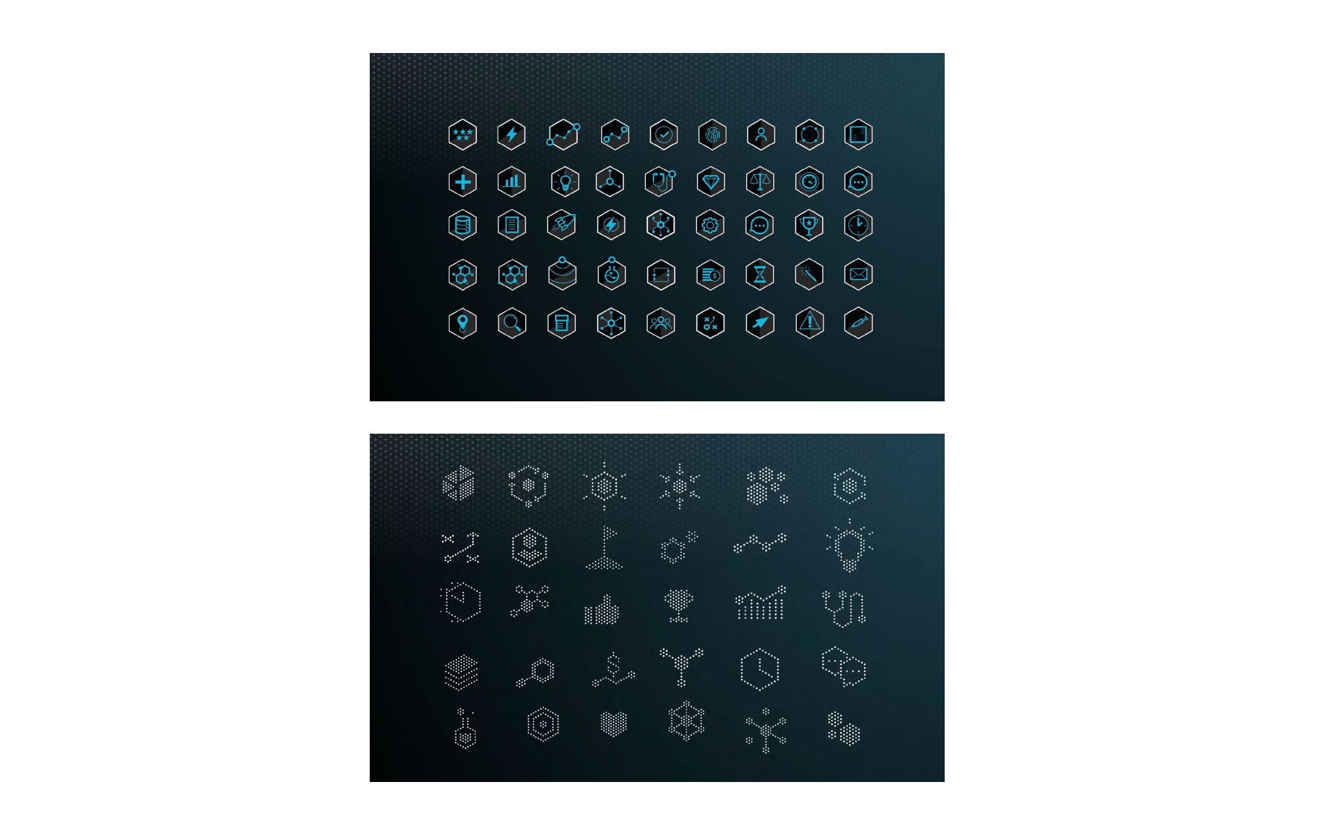
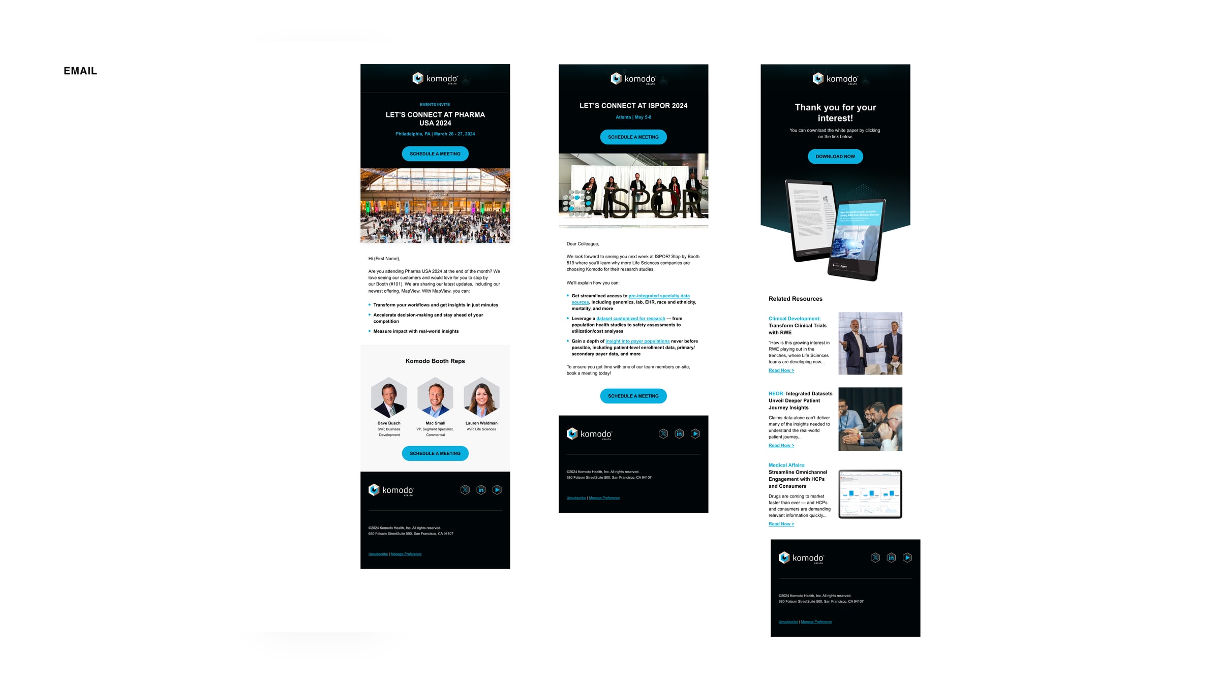
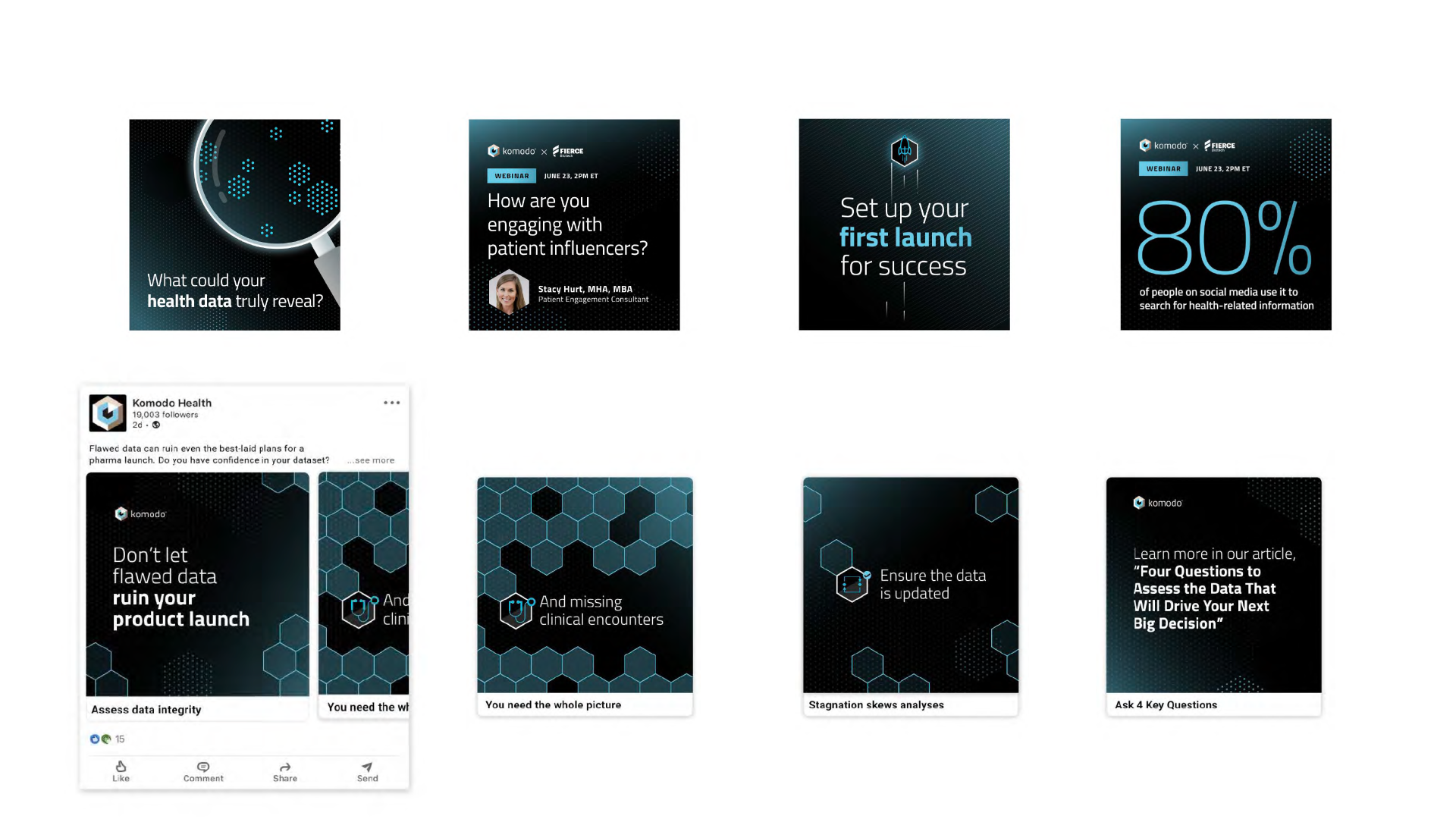
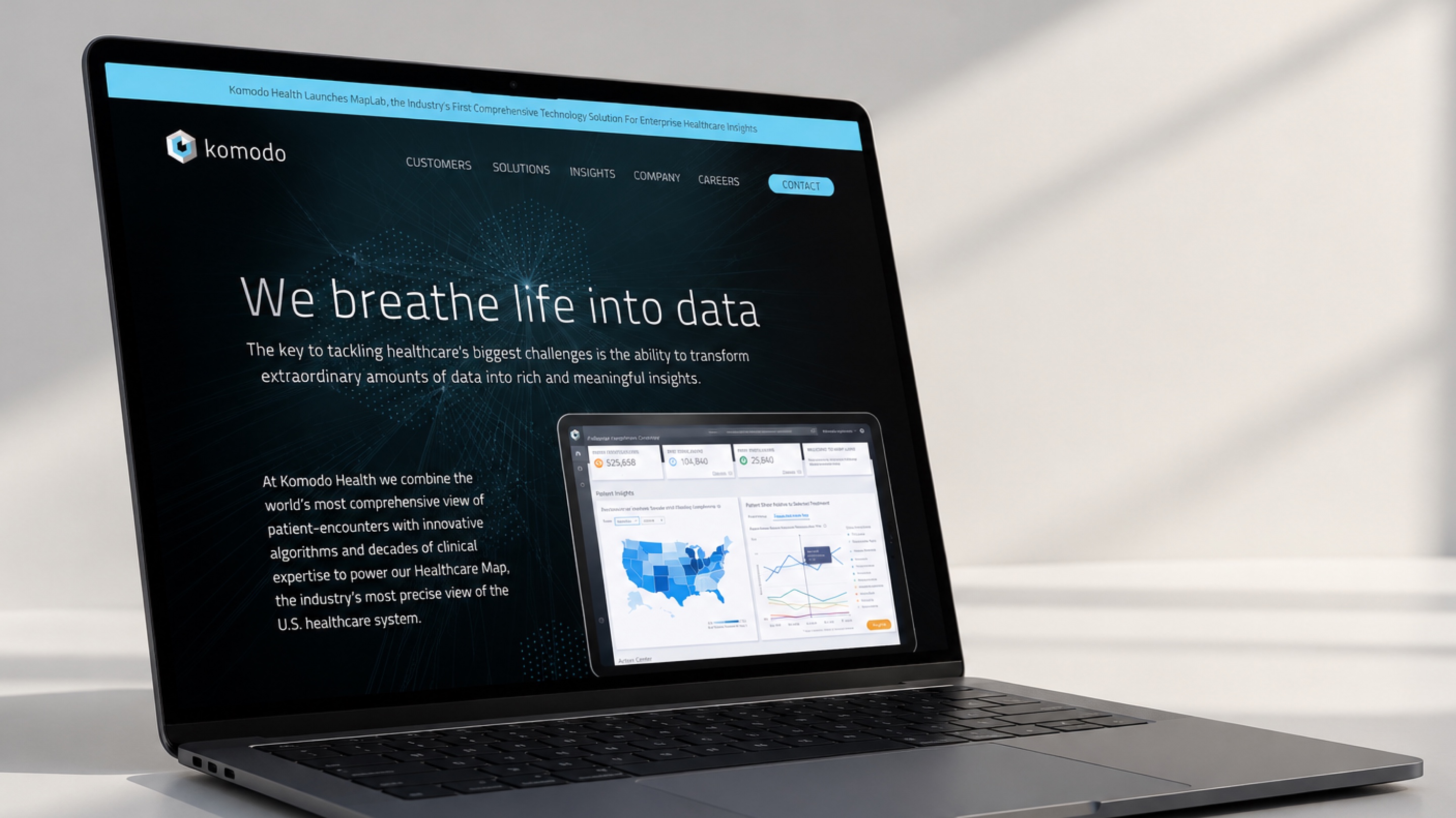
I shifted the narrative from software to human impact with “We breathe life into data.” The dot-based identity became a flexible visual grammar that connected product ideas, internal communities, and campaign stories—giving each application enough range to serve its audience across the website, product portfolio, sales materials, and company culture.